AirBnB Analysis
Neighborhood Identity in New York City
This project visualizes text data from Airbnb to create a narrative about neighbourhood identity and how this identity differs across neighbourhoods and between AirBnB hosts and guests. The themes being exploring are:
- Price (Affordable, Luxury)
- Interior (Cozy, Modern)
- Identity (Diverse, Hipster, Historic)
- Neighbourhood amenities (Bars, Parks)
- Pace (Quiet, Busy)
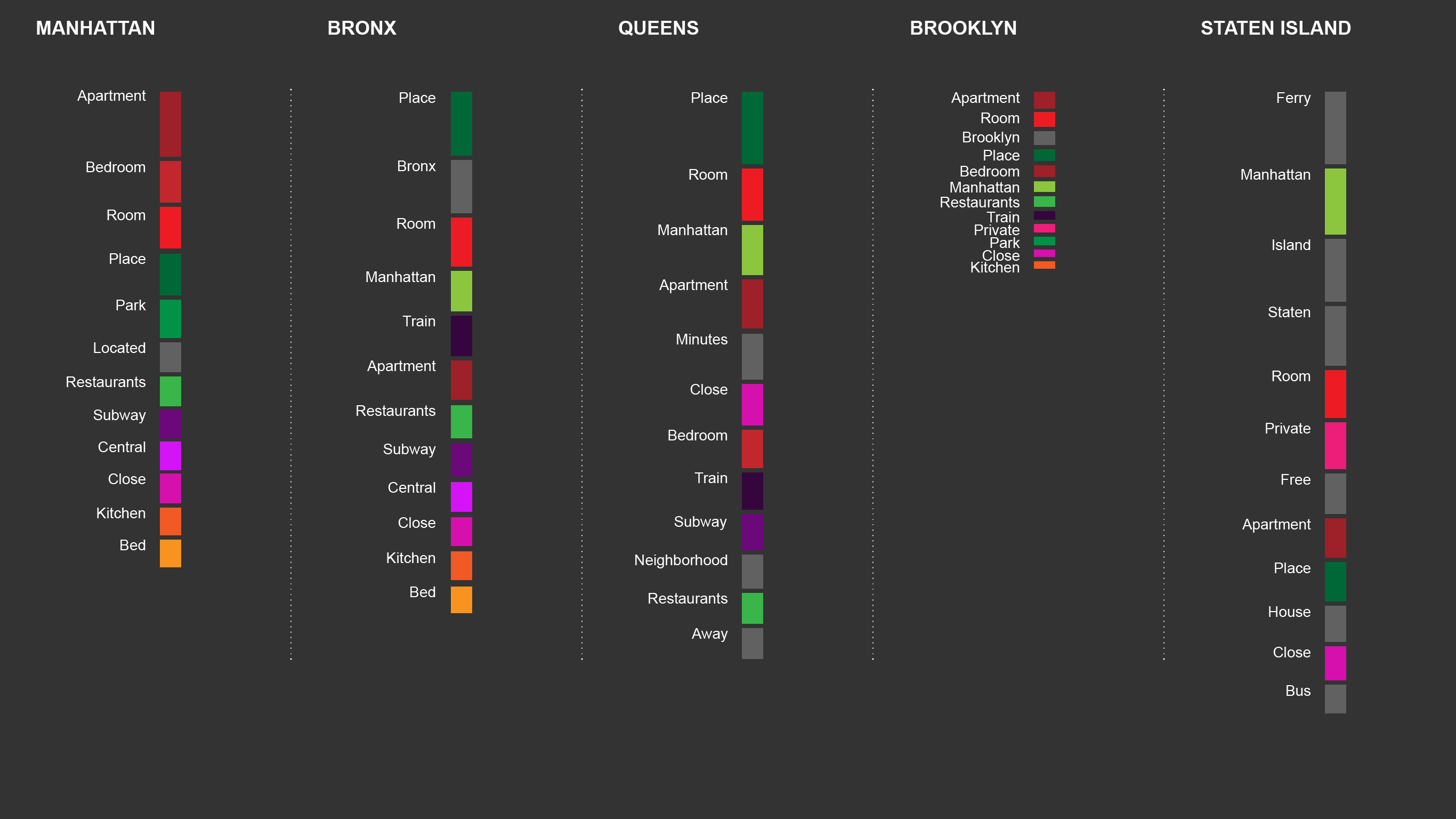
We are using these clusters of words to see how hosts in different neighbourhoods market themselves, whether their guests agree with their descriptions and to identity patterns that support or defy neighbourhood stereotypes.
Price Interior Identity Neighborhood Pace
DATA
We are using NYC Airbnb data from Inside Airbnb, “an independent, non-commercial set of tools and data that allows you to explore how Airbnb is really being used in cities around the world” (Inside Airbnb).
Disclaimers about the data from http://insideairbnb.com/about.html
- The data utilizes public information compiled from the Airbnb web-site including the availability calendar for 365 days in the future, and the reviews for each listing. Data is verified, cleansed, analyzed and aggregated.
- Some reviews may be "spam" allowed by Airbnb. Analysis suggests that spam reviews are small and do not affect the statistics.
- Neighbourhood names for each listing are compiled by comparing the listing's geographic coordinates with a city's definition of neighbourhoods. Airbnb neighbourhood names are not used because of their inaccuracies.
We will use a compressed csv of host descriptions and guest reviews. A list of explanatory variables are listed below:
PROCESS & CODING
We used text analysis of the airbnb host listing descriptions and guest reviews. Specifically, we used topic modeling to create clusters of similar words (i.e. entertainment = bars, restaurants, clubs; nature = green, space, open) and analyzed these topics in accordance with their prominence across neighbourhoods.
In order to provide the user of this website with a narrative instead of just an exploration of a data set, we analzyed the data first to find the topics that are frequently used in some areas but not in others; and the topics that differ between host and guest within a same neighbourhood. The particular topics and the words from which they are composed will depend on the results of this exploratory analysis. We were particularly interested in seeing whether host and guest perceptions of a neighbourhood differ and how.
The website aims to build a narrative and guide the user through the data story. The interactive piece will allow users to explore the neighbourhoods and topics that most interest them.
In addition, we also used R to do the text analysis of the data.
We were interested in comparing the difference in the perceived character of neighborhoods in New York, by comparing the way neighborhoods are described and presented in listings and reviews. We have developed a basic text mining program, to extract features from our listing and review datasets. Some features we are focusing on are word frequencies, correlations, which can be compared spatially and between listings and reivews. We've also applied basic topic modeling methods to develop and compare topics across the two texts regarding how neighborhoods are described, experienced and perceived.
CODING
We are comparing the difference in the perceived character of neighborhoods in New York, by comparing the way neighborhoods are described and presented in listings and reviews. We have developed a basic text mining program, to extract features from our listing and review datasets. Some features we are focusing on are word frequencies, correlations, which can be compared spatially and between listings and reivews. We've also applied basic topic modeling methods to develop and compare topics across the two texts regarding how neighborhoods are described, experienced and perceived. To visualize our results, we have developed word clouds, basic word counts and frequency plots, and an interactive cartogram/diagram. An area cartogram, also referred to as a value-by-area map, distorts the shape of predetermined regions on the map to correlate with quantitative information. Our cartograms were developed in QGIS and R and many of our static plot visuals were developed in R. Our code is on github.
We did the text analysis with R which was then exported as csv files to visualize in Javascript
